Videos and articles about the Noto Project
This lists videos and articles about the Noto project. They are date ordered, with most recent at the top.
Looking for Noto? It’s now on the Google Fonts website and API
- Website: Looking for Noto? It’s now on the Google Fonts website and API
- Author: Susanna Zaraysky, Content Strategist, Google Fonts
- Date: September 16, 2021
- Publisher: Google
Digitized Design for Nüshu Script: Noto Traditional Nushu
- Video: https://youtu.be/BhSbgRtV_pg
- Speakers: Zhao Liu, Eiso Chan, Kushim Jiang
- Length: 36 minutes
- Date: October 30, 2020
- Audience: Typography
- Publisher: ATypI
- Event: ATypI 2020
Nüshu, which means “female calligraphy” in Chinese, is a type of chirography that was primarily written by women in modern times. This specific type of chirography had only been handwritten, leaving no trace of prior existence in printed form. Nüshu has very unique shapes in comparison to Chinese. With only 398 characters, it took more than six years to establish an encoding scheme.
Typographic Nüshu wasn’t created until this year, making 2020 the first year of Nüshu Type. The release of Noto Traditional Nushu has a special significance for China. Firstly, it is the first typeface crafted and generated by the domestic design team in the Noto family. Secondly, it is also the first non-Hanzi Chinese language typeface in China. Liu Zhao Studio, a research-based independent design team in China, corrected the glyph errors on the code charts during the design process, and creatively used the methods of Latin type design. Type designers work with a diverse group of professionals in the field, such as encoding experts, grammatology experts, and advisors.
This presentation will tell the story of Nüshu type design from three aspects: the literature review, the encoding process, and the type design of Nüshu. The name of Noto Traditional Nushu also has a very interesting story. Habitual thinking tells us soft brush calligraphy is the traditional style of Chinese characters, while Nüshu script and monolinear styles seem to be more modern. However, through our research, we’ve found that it’s just the opposite. In this presentation, we will share the developmental story of Noto Traditional Nushu—the first Nushu family in the world.
Noto Fonts: Preserving Endangered Languages
- Video: https://youtu.be/DnuDOlPkFag
- Speakers: Susanna Zaraysky, Marek Jeziorek, Dave Crossland
- Length: 52 minutes
- Date: October 29, 2020
- Audience: General
- Publisher: ATypI
- Event: ATypI 2020
The Noto project is the most ambitious font project of all time, aiming to continually support 100 percent of all Unicode characters each year with fully functional fonts. Today, Noto offers fonts for 146 scripts and over 800 languages, and is opening the door to reading and writing for minority language speakers.
During the last decade, billions of people have found new options to communicate digitally in their preferred language or writing system, due in part to newly available fonts. According to UNESCO, “at least 43% of the estimated 6000 languages spoken in the world are endangered.” There are over 2.5 billion Android users globally, and as the default on Android, each Noto font enables a community’s culture to survive and thrive on the internet. For example, the Cherokee Nation in North America, with an estimated 20,000 speakers, uses Noto for texting, email, and teaching their language to the next generation.
Noto is used every day for Tibetan, Canadian indigenous languages, millions of African users, and hundreds of languages across Asia. According to UNESCO’s “Atlas of Languages in Danger,” 1,113 of the 2,572 languages reported are several and critically endangered and spoken primarily by community elders. Given age-related vision impairments, some of these speakers may have trouble reading small text sizes. When books, poetry, songs, and all kinds of texts are available in digital form; the ability to read minority languages fluently through the simple act of text magnification on-screen is important.
In this session, you will learn more about the most recently developed Noto variable fonts, their impact for endangered language communities and accessibility, and how you can contribute to the project to make reading truly universal.
Presentation by Susanna Zaraysky, Marek Jeziorek, and Dave Crossland, followed by Q&A with audience members.
Susanna Zaraysky is passionate about language learning and endangered language preservation. Zaraysky was the keynote speaker for the 2015 Foundation for Endangered Languages Conference on Music of Endangered Languages. Zaraysky made a documentary film, “Saved by Language,” about the endangered language of Ladino, and also held a TEDx talk on preserving endangered languages with music. She speaks eight languages and is the author of the book, “Language is Music,” focused on learning languages via music and the media. In 2014, Zaraysky participated in the International Mother Languages Day event, organized by the United Nations Academic Impact with school groups.
Marek Jeziorek was born and grew up in Poland. He initially studied Mathematics, Informatics, and Mechanics at the University of Warsaw. After four years of studies, in 1976, Jeziorek started vacation in the USA, where he’s been vacationing ever since. After receiving an MS in Computer Science in 1980 from the University of Wisconsin, Madison, Jeziorek worked as a compiler engineer at Intel. Since then, he’s worked for many companies in the San Francisco Bay Area, ending up with Google in 2003. Jeziorek joined the Google Fonts team as a Technical Program Manager in July 2015.
Dave Crossland attended the first Libre Graphics Meeting in 2006, and became fascinated with the potential of libre licensing to improve design. Since then, he has worked to liberate typography, mainly as a program manager for Google Fonts. He also regularly contributes to the Crafting Type, Font Bakery, and Runebender projects.
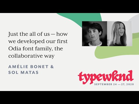
Just the all of us — how we developed our first Odia font family, the collaborative way
- Video: https://youtu.be/05nyT9NTR7E
- Speakers: Amelie Bonet, Sol Matas
- Length: 16 minutes
- Date: September 24, 2020
- Audience: Typography
- Publisher: TypeWknd
- Event: TypeWknd 2020
Many typeface designers have the opportunity at some point to get out of the cave and open their eyes to a project outside of their comfort zone and their daily design routine. That is where we found ourselves when we accepted a proposal to develop a font for the Odia script, a writing system in which we are not native. From the beginning, we understood that collaboration would be our best strategy to face this challenge; designing and producing a typeface in a writing system we do not know nor understand.
The collaborative experience was extremely enriching and gave us a different perspective on our practice. However, we also encountered some limitations during that process. Our talk will shine a light on collaborative processes. We will present our typeface, Noto Sans Odia, through the prism of exchanges we had during the making of the project: communication between the designers, teamwork with the consultants, discussion with the software makers (Glyphs), etc. The collaboration between us all is what made the project possible.
The Road to Noto
- Video: https://youtu.be/HHIFL7DxOP0
- PDF slides: https://tug.org/tug2020/preprints/Matteson-slides.pdf
- Speaker: Steve Matteson, Monotype
- Length: 42 minutes
- Date: August 31, 2020
- Audience: General
- Publisher: TeX Users Group
- Event: TUG 2020
Steven is the designer of Open Sans, Droid, Liberation, Noto Sans for Latin, and many more typefaces. He has worked on a vast array of other typographic projects present in operating systems, phones, game consoles, and other electronic devices. He will walk us though the creation process that led to Noto.
The road to Noto begins here with the Rosetta Stone, a three and a half foot tall tablet that you’re probably all familiar with. Three different languages, three different writing systems. A fascinating example of the painstaking efforts made to produce a document in multiple languages in this case, hieroglyphics, Demotic script, and ancient Greek. All with the aim that multiple cultures and generations would understand.
Fast forward 1600 years to 1573 to Christoph Plantin’s polyglot Bible printed in Antwerp and funded by King Philip of Spain. The translations were in Hebrew, Greek, Aramaic, Syriac, and Latin. The achievement here is the complexity of the formatting and the quality of printing that is just inconceivably beautiful, particularly compared to where we are 400 years later.
It’s now commonplace to see multilingual text in institutional documents. The line lengths are too long for many of the scripts, and the variety of type styles makes it appear like a ransom note, rather than a document from a well-branded company or institution.
If a computer system is missing a character, the reader sees the undefined glyph as an empty square. As Bob Jung put it, the squares remind a lot of people, particularly in Asia, of packaged bean curd or tofu. And this is where Noto got its name, no tofu.
How to Kill a Writing System
- Video: https://vimeo.com/435930677
- Website: How to Kill a Writing System
- Speakers: Zachary Scheuren, Ripon Chakma, Mangu Purty, Sunita Dangol, Vinodh Rajan
- Date: Jun 16, 2020
- Length: 1 hour 20 minutes
- Audience: Typography
- Publisher: Letterform Archive
Writing systems live and breathe with the people who use them, but sometimes they can become difficult or impossible to use. In many cases a writing system has been deliberately pushed out of use or even out of existence. What does it take to kill a writing system? What does it take to bring one back to life? In the current digital world if a writing system is implemented in computing systems it can be immediately seen and used by billions of people around the world. However, if there is no support users must resort to other means. But why should they compromise?
Scheuren will be joined by local and native experts in a variety of endangered scripts, including Mangu Purty (Warang), Ripon Chakma (Chakma), Sunita Dangol (Newa), Vinodh Rajan (Grantha).
CJK Variable Font Based on Source Han Sans
- Video: https://youtu.be/9YtRMNdH4Lo
- Speaker: Masataka Hattori, Adobe
- Date: Sep 12, 2019
- Length: 16 minutes
- Audience: Typography
- Publisher: ATypI
- Event: ATypI 2019 Tokyo
This session details a personal project by Masataka Hattori at Adobe that examines what is required to develop a fully functional CJK variable font that supports design-variation axes other than for weight, and explores the one for width. A typical Western variable font would support axes not only for weight and width, but also for optical sizes (and possibly slant). CJK fonts, on the other hand, are quite complex due to multiple and sometimes unrelated scripts, such as kana, hangul, ideographs, Latin, and so on, and include both full-width and proportional glyphs. One important consideration for CJK variable fonts is vertical layout: the glyphs for some characters remain upright, while others are expected to rotate.
Consider a CJK Variable Font with a width axis and how it should be used in vertical layout. How should the glyphs for Western characters in vertical layout be treated? Should such glyphs be compressed or expanded, and, if so, in which direction? How can such CJK variable fonts be developed? This presentation contemplates the ideal CJK variable font by posing these and other difficult questions.
Invisible Letters, Invisible Language
- Video: https://youtu.be/PcS_mE5dDCw
- Speaker: Zachary Scheuren, Monotype
- Date: Oct 20, 2019
- Length: 21 minutes
- Audience: Typography
- Publisher: ATypI
- Event: ATypI 2019 Tokyo
If we can’t see a language, does it exist? Of course it does. However, in an increasingly computerized world, many languages remain invisible. Some languages have no writing system to be seen. Others are not necessarily accessible in the digital realm. What are the implications for these languages in light of today’s technologies? Computing in general is grounded in the assumption that spoken language can be transcribed and manipulated. But who are we leaving behind and why should we care? The benefits of digital representation aren’t limited to the locale of a particular language, script, or culture.
The possibilities range from linguistic analysis to all forms of cross-referencing across disciplines like linguistics, history, archaeology, literature, sociology, economics, anthropology, and more. This presentation will look at a number of historic and minority writing systems and consider what can be gained by digitizing them and making them accessible to the world.
The Noto Project
- Video: https://youtu.be/cekCfRoMlAU
- Speaker: Kamal Mansour, Monotype
- Date: May 08, 2019
- Length: 37 minutes
- Audience: Typography
- Publisher: Marek Z. Jeziorek
- Event: SF Globalization Meetup
Ambitious in its scope since its very beginning, the Noto project has aimed to provide fonts to support all the scripts in the Unicode Standard. The name “Noto” stands for “no tofu”—tofu being the square symbols that appear on the screen when a character isn’t supported by the font in use. By now in its seventh year, the Noto project is still active today. Over several stages, the project has supplied open-sourced fonts that support more than 120 scripts, both living and historical. What hidden infrastructure has made the Noto project feasible? What has made this a ripe moment for its fulfillment?
In order to develop fonts for such a broad variety of scripts, one must pose many questions before attempting to find the answers. What style is most appropriate for this particular script? How do you make a font for a script that has no typographic history? Faced with competing styles, how do you settle on one of them? What if the historic record for a script is very sparse? Where do you find a script expert? What if there are no experts? Come join us as we explore some of these questions and share some interesting anecdotes about the Noto project.
Kamal Mansour’s bio: An early multilingual education served to stimulate Kamal’s interest in languages, alphabets, and later on, typography. His studies have spanned Computer Science, Linguistics, and Product Design. Since the mid 1990s, Kamal has worked on the typography of many languages from around the globe. During that time, he has been involved in the development of the Unicode Standard which enables the digital support of all the world’s languages. In addition, he has extensively developed code necessary for the correct typographic shaping of many complex writing systems. Over the past 7 years, Kamal has played a leading role in the Google Noto Font project whose goal is to create fonts for all the languages of the world. Since 2006, he has served on the Board of Advisers of the Script Encoding Initiative of UC Berkeley. He has also taught a linguistics course at Stanford University entitled “Writing Systems in the Digital Age”.
Variations on Variations
- Video: https://youtu.be/4_Dy3-_MyiA
- Speakers: Dominik Röttsches (Google), Behdad Esfahbod (Google)
- Date: Apr 8, 2017
- Length: 51 minutes
- Audience: Font makers
- Publisher: TYPO International Design Talks (Monotype)
- Event: TYPO Labs 2017
Behdad will talk about updates to the variable fonts building pipeline based on FontTools. Dominik provides an update on implementation progress of variable fonts in a development version of Chrome, including a live preview of variable fonts capabilities in the Chrome browser. He will also explain how you can start your own experiments with variable fonts in Chrome.
Introducing Source Han Serif, Adobe’s open source Pan-CJK typeface
- Video: https://youtu.be/6QH2mJVOOzM
- Date: April 4, 2017
- Length: 6 minutes
- Audience: General
- Publisher: Adobe Fonts
Noto CJK and its sister project, Source Han, made by Adobe and Google, provides users of Chinese, Japanese, and Korean languages with powerful tools for digital text communication. Creating Source Han Serif was an enormous collaborative effort. In this short video, the creators summarize and reflect on the many, many months of work that each partner contributed to the project of creating a truly international typeface.
The ‘noto-hinted’ project
- Video: https://youtu.be/LZ-PZDy8WHY
- Speakers: Werner Lemberg, Freetype; Sascha Brawer, Google
- Date: Apr 8, 2017
- Length: 50 minutes
- Audience: Font makers
- Publisher: TYPO International Design Talks (Monotype)
- Event: TYPO Labs 2017
Commissioned by Google, the ‘noto-hinted’ project (set up at github) was the driving force behind ttfautohint in the last two years. The goal is to provide good automatic hinting for the Noto font family, covering a large set of scripts. The talk describes the history and setup of the project, together with possible future enhancements.
Index:Award 2017 finalist: Noto font family
- Video: https://vimeo.com/221579404
- Date: June 14, 2017
- Length: 1 minute
- Audience: General
- Publisher: The Index Project
The Open Source Python Font Production Pipeline
- Video: https://youtu.be/TtHSnw0LI6o
- Speakers: Marek Z. Jeziorek, Google; Behdad Esfahbod, Google
- Date: Oct 25, 2016
- Length: 27 minutes
- Audience: Font makers
- Publisher: ATypI
- Event: ATypI 2016 Warsaw, Poland
The Open Source Python Font Production Pipeline is a set of tools build by the open source community, including Google developers. It has been used by Google to produce Google’s Noto font families. It can be used by anybody to automate their font production. The pipeline takes various inputs (e.g., *.glyphs files) and compiles them into multiple binaries (*.TTF and *.OTF files among others). This presentation is about why Google wanted to have an open source font toolchain, how the toolchain (aka pipeline) was architected, engineered and debugged and how Google uses it to produce and validate Noto fonts.
Creating Noto for Google
- Video: https://youtu.be/16_NYHUZ1kM
- Website: More than 800 languages in a single typeface: creating Noto for Google.
- Date: October 6, 2016
- Length: 7 minutes
- Audience: General
- Publisher: Monotype
A typeface five years in the making, Google Noto spans more than 100 writing systems, 800 languages, and hundreds of thousands of characters. A collaborative effort between Google and Monotype, the Noto typeface is a truly universal method of communication for billions of people around the world accessing digital content.
A Tour of Android Typography
- Video: https://youtu.be/L8LD0BM-Vjk
- Speaker: Raph Levien (Google)
- Date: May 3, 2016
- Length: 25 minutes
- Audience: Developers
- Publisher: ATypI
- Event: ATypI São Paulo 2015
One Font to Rule Them All
- Video: https://youtu.be/AAzvk9HSi84
- Speaker: Xiangye Xiao, Google
- Date: July 8, 2015
- Length: 7 minutes
- Audience: Developers
- Publisher: Google Developers
- Event: 100 Days of Google Dev
Noto is a font published by Google that aims to support all languages in the world. Now it has supported almost all major living languages. For most languages, eight styles are supported: {regular, bold} x {normal, italic} x {sans serif, serif}. It is used by Android and Chrome OS as the default system fonts and is also recommended by Google’s Material Design. What’s more important, Noto is open source and everyone can use it.
Using Noto is easy. If you are developing a mobile app, simply bundle the fonts with your app. If you are a website developer, use Noto fonts as Web Fonts. Many Noto fonts are available to use at Google Fonts Early Access. You can also host the fonts in your own server and specify them in web pages.
Type Reinvented: Glyph.Index
- Video: https://vimeo.com/128597540
- Date: 2015
- Length: 2 minutes
- Audience: General
- Publisher: Monotype, FIELD.io
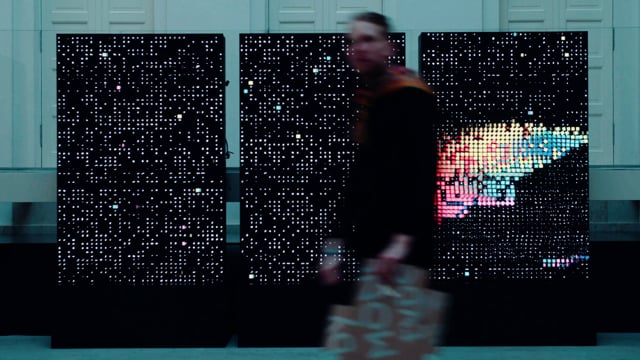
First displayed at Resonate Belgrade, Glyph.Index is an infinite interactive journey through the vast spectrum of Unicode glyphs in the Noto Sans typeface and its 96 font variations. Noto Sans is the only typeface designed to represent every symbol in every language— over 60k characters. Glyph.Index celebrates the global community and its cultural diversity in playful, rhythmical, ever-changing patterns.
Type Reinvented. In today’s information-dense digital landscape, typography is the key communicator to reach across all media. Monotype’s Type Reinvented explores the future of typography in a series of interactive digital artworks created in partnership with FIELD. How can typography become responsive, emotional, platform-adaptive, whilst remaining a powerful messenger of information, style and identity?
Making Noto Sans Tibetan
- Video: https://youtu.be/liU8fHOtHYA
- Speaker: Toshi Omagari (Monotype)
- Date: July 25, 2015
- Length: 18 minutes
- Audience: Font makers
- Publisher: GRANSHAN Conference
- Event: Granshan 2015
Unicode, OpenType and Fonts
- Video: https://youtu.be/sMkO4gF4-3U
- Speakers: Behdad Esfahbod (Google), Roozbeh Pournader (Google)
- Date: May 22, 2015
- Length: 1 hour 10 minutes
- Audience: Developers
- Publisher: Behdad Esfahbod
- Event: Unicode Conference 2014
