Noto Sans Nüshu - process and progress
Phase 01 - Introduction
November 2019
Noto Sans Nüshu project have been suggested to me quite unexpectedly. I have seen Nüshu mentioned before in a few books about Chinese scripts history, but never really dove into it that much further (I’m a type designer, not a linguist of historian in writing systems, even if these fields bring me lots of interest!).
The idea of working on a digitized version of a script in between disappearance and revival, created and developed by women, in a remote region of China, that has never been digitized and published in any fonts (yet), triggered me much interest! The other challenge is also to design a set of characters (396 glyphs, not thaaat much) to make them fit into a larger family such as Noto Sans Regular (Latin and Hanzi parts, as references) with design features and characteristics already in place, with an entire design process to be defined from scratch…
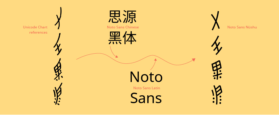
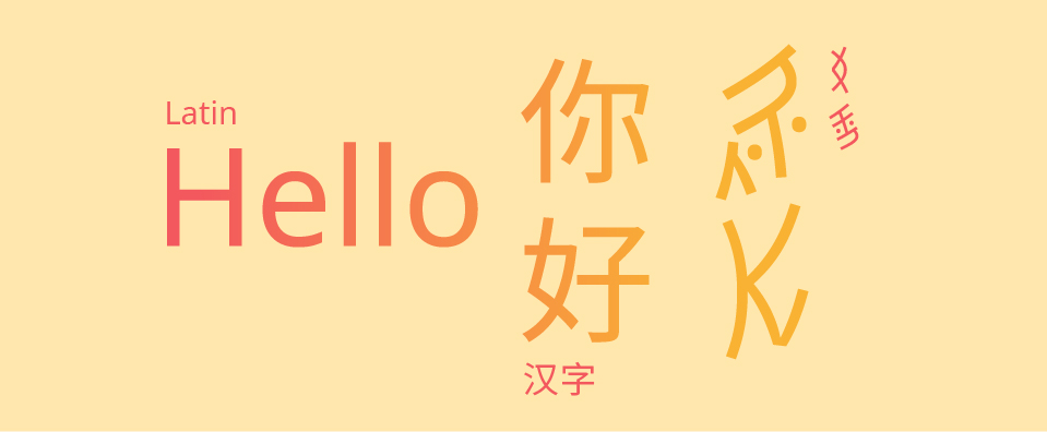 with Noto Sans Regular in Latin, Chinese and Nüshu
About Nüshu script, besides having no digital presence as (published) fonts yet, there is a large variety of content on the web, both relevant, interesting and intriguing, and also unfortunately not so much accurate… There is a handful of articles superficially talking about the script, sometimes relevant but also not so much accurate, or at least quite doubtful… And there is also no published fonts with Nüshu (yet) at all. From what I could find on a first round, a few names of researchers specialised in the script pop out regularly. The most frequent and serious one is Pr. Zhao Liming (赵丽明博士), professor in Chinese Linguistics specialised in endangered languages at Tsinghua University in Beijing. She and her research team from the university is also the one that made an incredible work of selection of the 396 glyphs added to the Unicode chart (see Theory and Rules of Nushu Character Unification, Liming Zhao, Sept 23, 2014).
I had the chance and opportunity to meet her in person at the university. She generously gave me insights and introduction of Nüshu script specificities from her experience and knowledge of her several decades study. Then, to the region where Nüshu was originally from, and is still used nowadays: Jiangyong county (江永县), at the south west tip of Hunan region, I could get the most proper insights I could hope for and dive into this culture. Jiangyong county is not one of those large and modern cities in China like Shanghai, Beijing or else… It is quite the opposite and requires some motivation to get there (by train, car or bus). But the only fact that a complex thing like a writing system happened in such a remote region, by women on their own without any education, and of course the sightseeing of a rural China, in some villages that kept their personality since several centuries, it is really worth it.
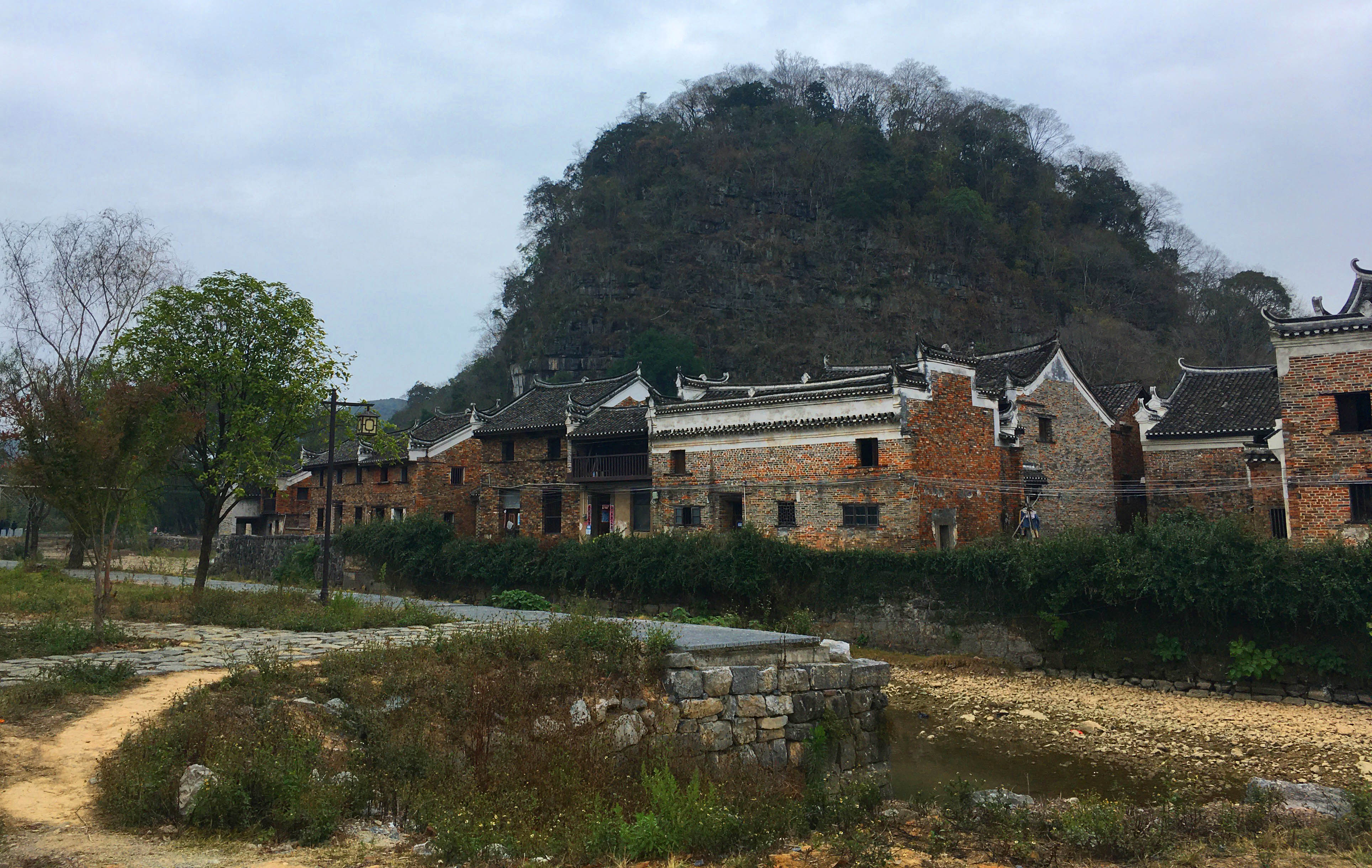
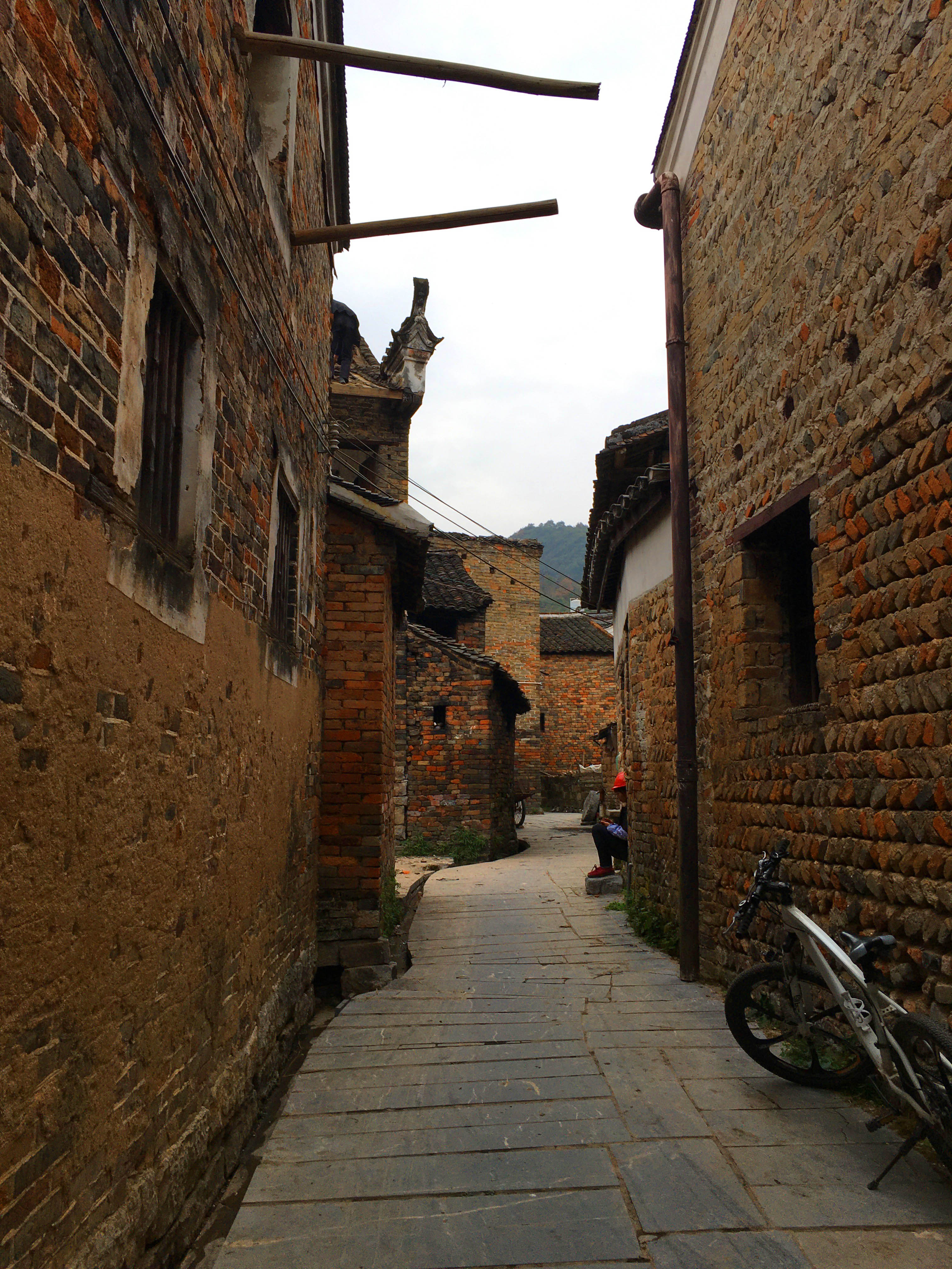
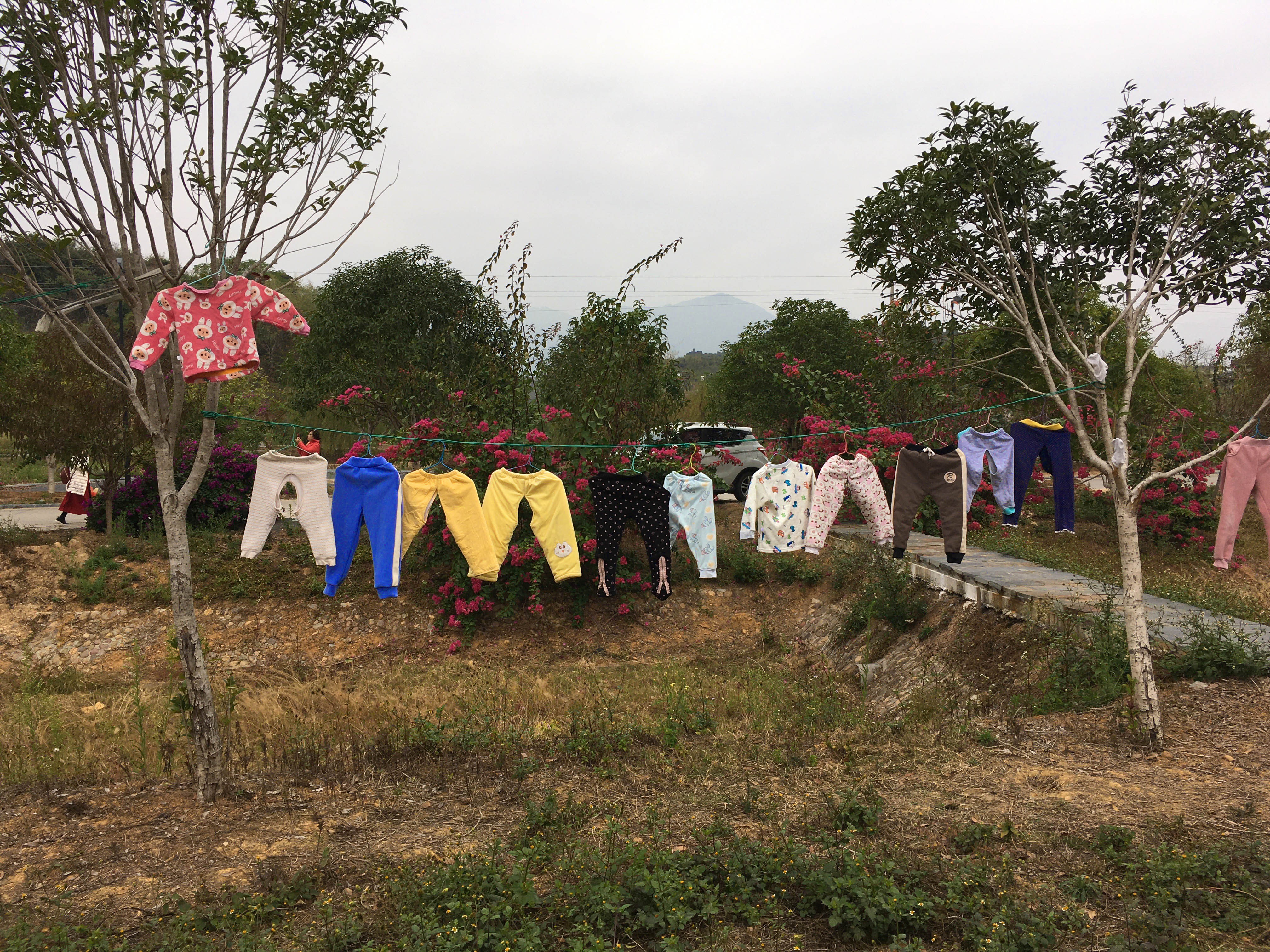 photos of Shang Gan Tang village 上甘棠村, one of the most representative villages of Jiangyong county, photo by Lisa Huang, 2019.
Jiangyong is also where local governments invested ressources to build the Nüshu script Museum inaugurated in 2004, and encourage the study and promotion of the script as it has a peculiar touristic attractiveness (especially with feminist movements). The museum is now a place fully dedicated to the script, its history, evolution, local women’s life and folklore, with even Nüshu summer classes every year.
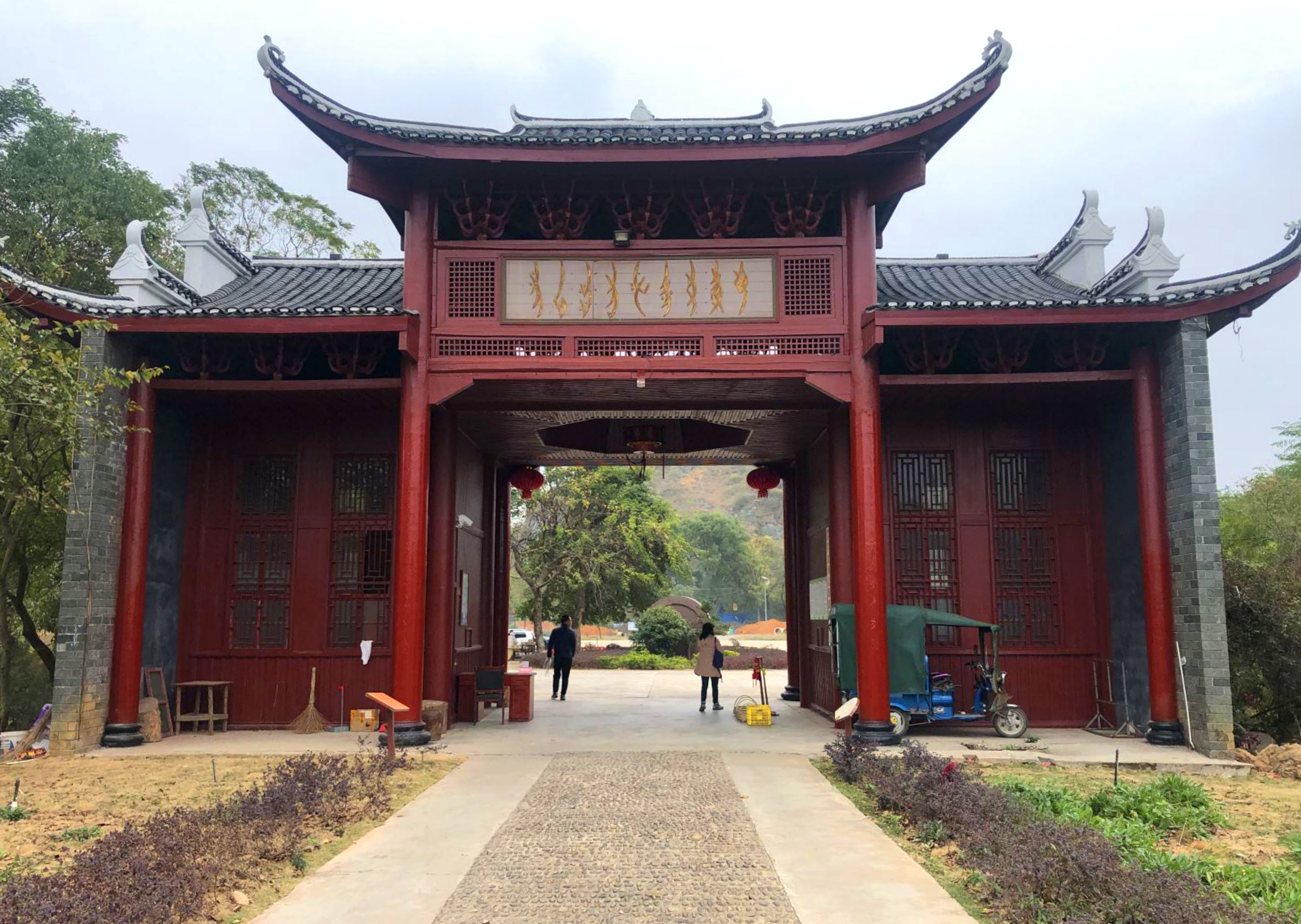 entrance of the Nüshu script Museum, near Jiangyong city, photo by Junyu Deng, 2019
Phase 02 - Assimilation
December 2019 to January 2020
Once being back in Paris, with all the documents, informations and photos I could take, items I found relevant to have, and of course emotion and thoughts towards this script, I had to digest it all and look for what could be extracted from there and how to use it for digitization of a script that have never been digitized before…
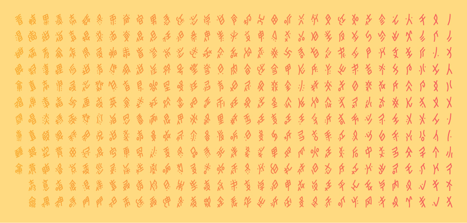
I tested a first round of digitized glyphs for Noto Sans Nüshu (thanks to Stephen Nixon’s help) — quite early — to also get familiar with how the script would fit into a digital version. There was already questions about Nüshu glyphs proportions compared to Latin letters, weight, widths and heights, terminals, inktraps, dots,… all these various elements that are part of a completed typeface. And from this step, I realised how much work of tests and adjustments on the glyphs there will be… Because there is no guidelines set about Nüshu in digital yet, or even precise guidelines with written Nüshu characters (as a reminder, there was no academic teaching of Nüshu, so variants depending on each person’s taste are very frequent…).
First attempt of digitzed Nüshu glyphs matching Noto Sans Latin and Chinese with a selection of glyphs, a personal take on a Nüshu version of “Hamburgefonstiv” or “Handgloves”: very few strokes, most strokes and a few others in between with very common shapes.
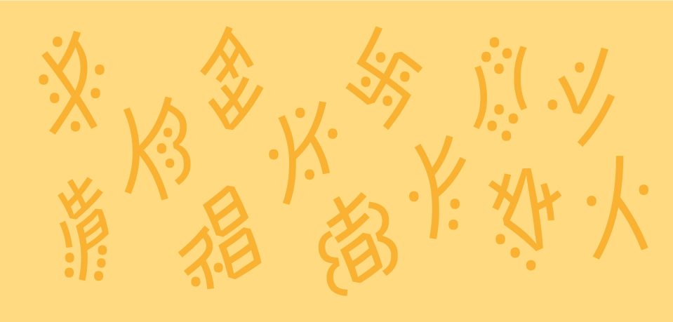
With the 396 glyphs, they have different constructions and various elements combined in them. But there are strokes and shapes found in common for a large part of the glyphs, and an arrangement of them by similarities or common elements would help making consistent designs through the entire character set. Some of the characters seen on calligraphies or documents are not in the Unicode chart, which is sometimes sad, as there are quite funny ones!
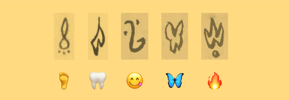 emojis before digital era??
To do the sorting relevant and bring sense to it, I had to think which are the basic shapes or elements in Nüshu, just like how we would take n letter and join it with other similar letters: h, m, r and u. They are presented at the Nüshu script Museum, but many forms showed there are not in the selected 396 glyphs in the Unicode at all, as it is again another interpretation from a single woman of what those basic elements should be…
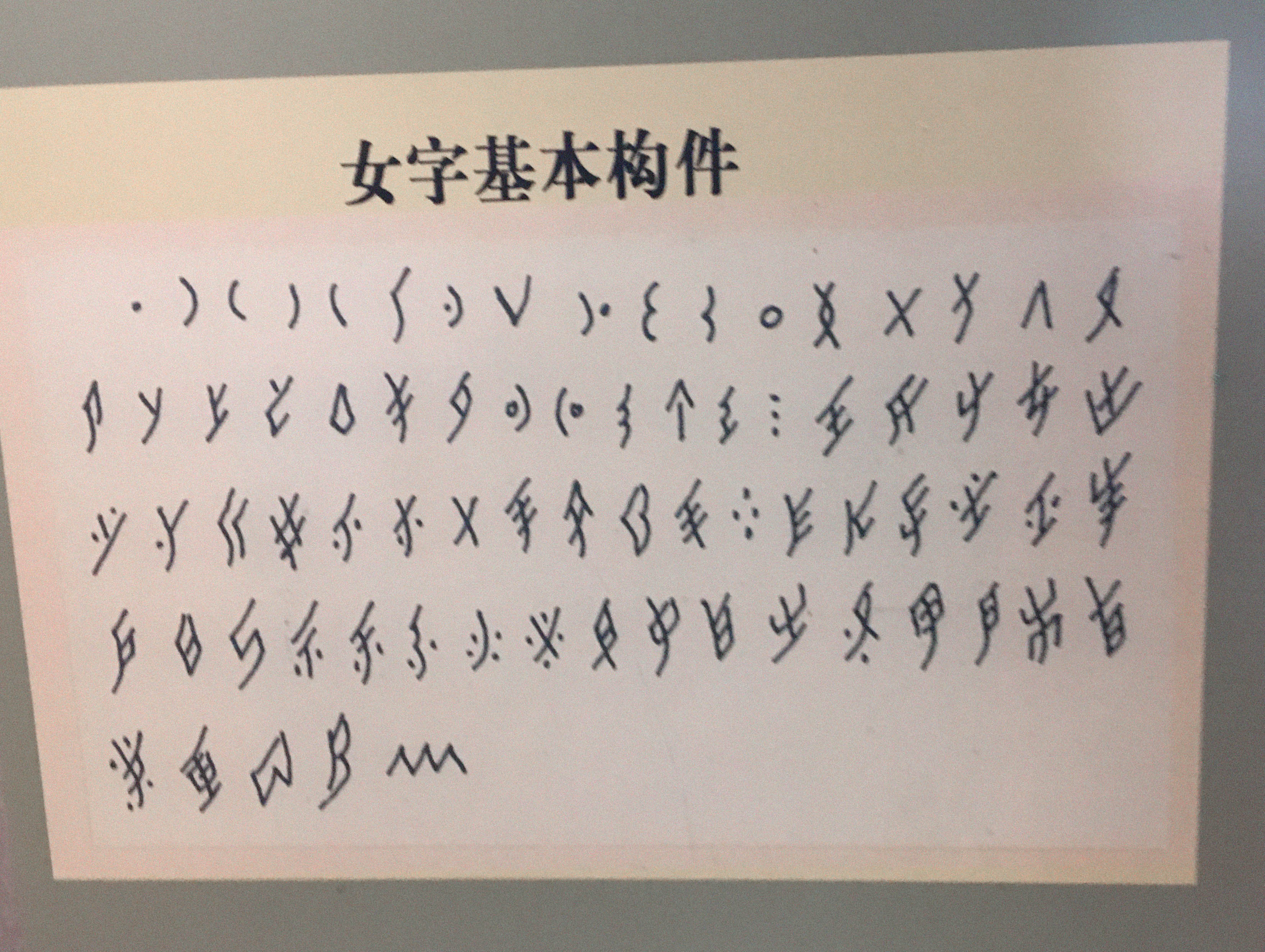 Set of basic strokes used for Nüshu writing, presented in the Nüshu script Museum. Courtesy of the Museum, 2019
By focusing on the glyphs present in the Unicode chart, and with the same logic as there would be with Chinese Hanzi, I sorted them out by similarities, with the top part of each glyph as a priority (on written documents, it is obvious that the top part of the glyphs have the emphasis).
Get to the Unicode chart, range from U1B170 to U1B2FF for Nüshu glyphs: Unicode chart Nüshu
Nüshu glyphs from Unicode tables sorted - Round 01 and conclusion Nüshu glyphs from Unicode tables sorted - Round 01, then deducted sorting Round 02 after examination of samples
From this first round of sorting, a few uncertainties appeared for a few glyphs that look pretty close but not quite, according to the sample in the chart.
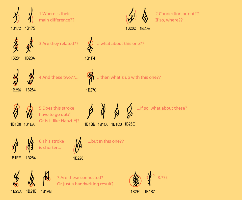 and this is only a few of them…
And by examining the various documents, from various authors, there are also significant variations for a same character from one writer to another… With such a neutral and standardized typeface as Noto Sans, the need to bring those same features to Nüshu characters is a very important point.
Phase 03 - Deduction
2 to 3 February 2020
As there are many variants of a same glyph depending on the authors handwriting, there are many uncertainties about the details. First, from one writer to another, there can be different glyphs used to transcribe the same sound (glyphs overlap). These glyphs have been sorted out and the most used, therefore the most common, have been already selected and chosen to be part of the Unicode charts after a long research and selection work made by Pr. Zhao Liming and her team. Then, for one glyph (in terms of general structure), there can be significant differences when written by different writers.
I scanned most of the documents I have collected with Nushu (I left aside those with strong calligraphic styles and kept all the samples written with a pointed nib pen or rounded pen), gave an index to each author in their order of birth (so that I could also see, if there is, an evolution in the writing from one generation to another, when it’s possible…), cut out each characters one by one, and grouped them by glyph in this table.
To make the sorting easier to work with from a designer’s point of view, I grouped first the glyphs from the Unicode chart U1B170 by similarities, from the most simple in construction to the most complex.
08-nushu-samples-scans-table.pdf
Nüshu glyphs from Unicode tables sorted - Round 02 Nüshu glyphs from Unicode tables sorted - Round 02
Nüshu glyphs table sorted with Noto Sans Nüshu Nüshu glyphs table sorted with Noto Sans Nüshu
To make the glyphs in a Noto style — neutral and standard (so to speak) — I had to see which features of a character appear the most frequently. Even if the number of writers is quite limited (about 13-14 in total) and most of them are women of the post-Nushu era (see presentation, section 08. “Discovery” of Nüshu script). The quality of this process can of course be questioned by academic researchers, and it would be best to work on it again, on the field, with the women teaching the script right now to see which characters are taught nowadays and how do they look like. This would be eventually a process for a perspective that is definitively turned towards present times, rather than on any remains we can still grab on to…
Phase 04 - Decision
02 March 2020
After a first session of sorting and grouping samples of characters (there will be likely a second round with addition of missing examples or very few of them…), I broke down remarks, questions and a first round of decision on the design of Nüshu glyphs in Noto Sans.
01 - Basic construction
The composition and structure of a Nüshu character in a lozenge frame is one of the main features stated in the description of the script itself. There is no changing metrics (meaning no ascenders or descenders) from one character to another, as in all Nüshu texts the characters are aligned both vertically and horizontally. There are no short glyphs and longer ones. 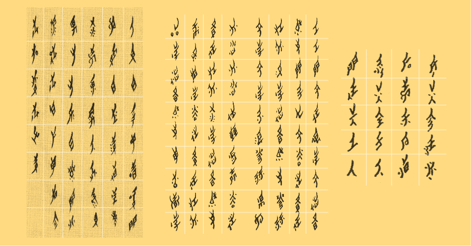 writers from left to right: Hu Meiyue, Xie Shaolin and He Yanxin
01.A - Spacing (vertical, and not horizontal)
I made an average measure of space measurement between two characters, and set this as the one for Noto Sans Nüshu. It is clearly shorter than the lenght of the column space, but there is no consistent ratio between both. 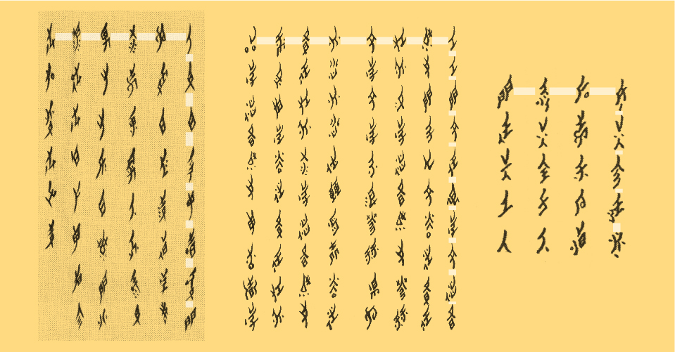
01.B - Baseline
The baseline as we consider it with Latin glyphs is different for Nüshu characters. There are written following a central vertical line. 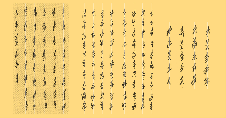
01.C - Line height, or in this case, column space
As they are written vertically, the space between two columns of characters has to be wide enough to ease the reading. 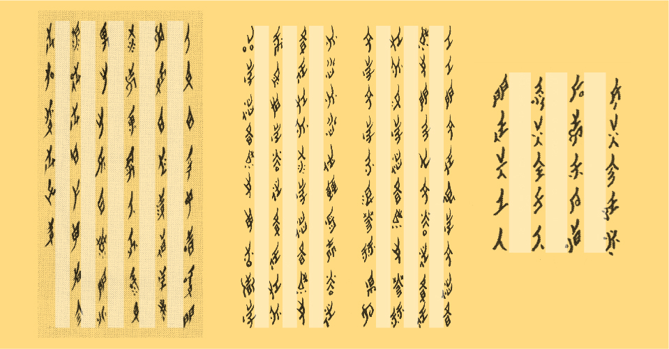
02 - Proportions
Another main feature of Nüshu characters is their elongated proportion. Documents are mostly presenting a horizontal alignment of every characters for fluid legibility, so a consistent (optical) height can be a feature to uniformity.
02.A - Proportions compared to Latin
Nüshu characters are (generally) set in the opposite direction compared to Latin in a text, other directions arerare exceptions. A match in weight and color for both scripts is still to be considered, in cases like texts inEnglish and Nüshu characters are set together in academic texts for example. Nüshu characters proportions aredefined here to visually look uniform side by side with Latin letters. 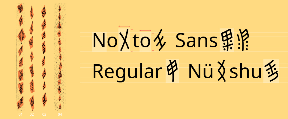 writers: 01 Gao Yinxian, 02 Hu Meiyue, 03 He Yinxian, 04 Anonymous
02.B - Components proportions between each other
We see elements, as components, attached to what seems to be the main part. Some elements can be found in combination with other main components in other glyphs. Which proportions they should have between each other is something to check with the comparison with grouped characters. 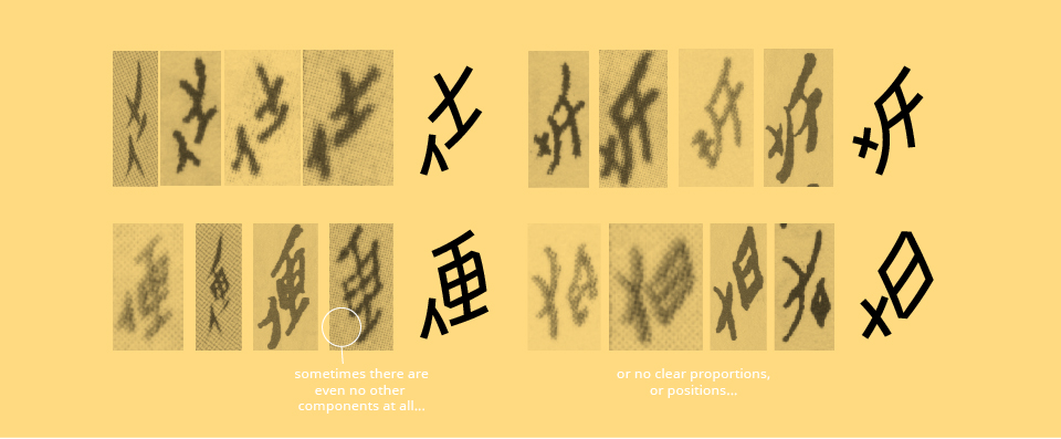
In other situations, some glyphs are a same one doubled. Now, is there one smaller than the other one is also a question that seeing the comparisons can be dealt with. 
03 - Curves
Curves strokes is a specific feature to Nüshu that has to be kept even in a sans serif such as Noto Sans. The degree of curvature had been defined to be present without exaggeration. 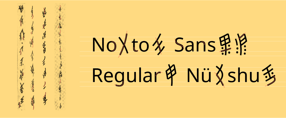
04 - Stroke endings
Noto Sans in Latin has different shapes for horizontal or vertical endings, and also perpendicular ones for the top endings. This last feature in Noto Sans Latin seems to be the one that can be ‘borrowed’ into Nüshu characters and give a feeling of design consistency without denaturalize Nüshu script, as they are all starting or ending with the pen on or off the media without any other detail (there are no serifs anywhere on Nüshu glyphs). 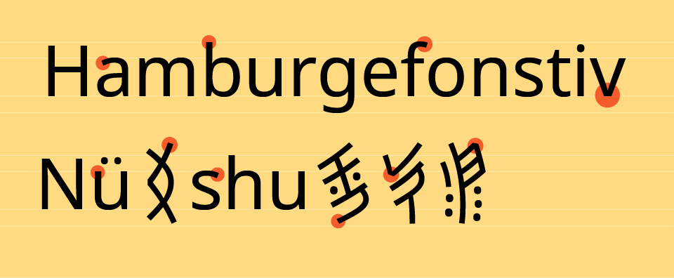
05 - Strokes lengths
05.A - With lines
The length of many strokes, weither they are on the left or the right side of the character, can be different from one another. If we follow the rule of “left side lower than right side” (左低右高), for the bottom stroke endings, the left stroke should end to the bottom line while the right one is higher, even though there are a few exceptions. And it should be the opposite for the top stroke endings. We see this rule applied in many hand written characters. 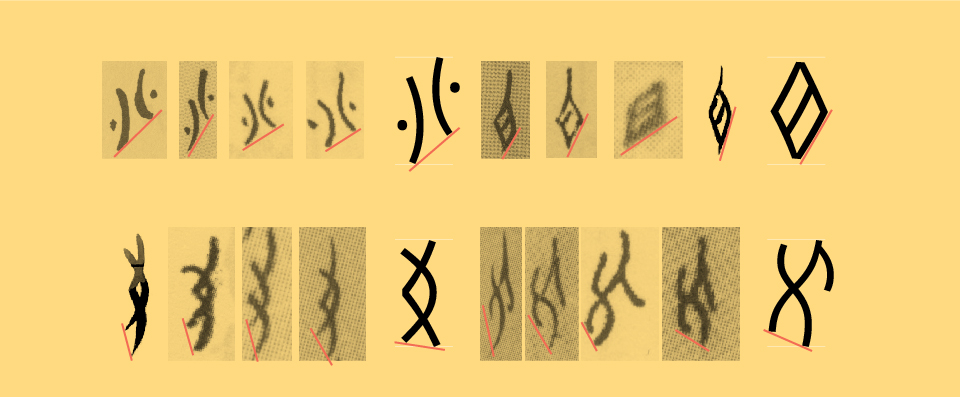
05.B - With closed shapes
With several squared shaped glyphs, we see the first stroke (on top left) going even further to the top than the rest of the square’s ‘body’. After examining the comparisons, we can deduce that even if it gives a charming and elegant look to the overall shape, this is a stylistic feature and is not part of the glyph’s standard structure. Though this could possibly be taken in consideration for a ‘serif-like’ style of Nüshu typefaces. 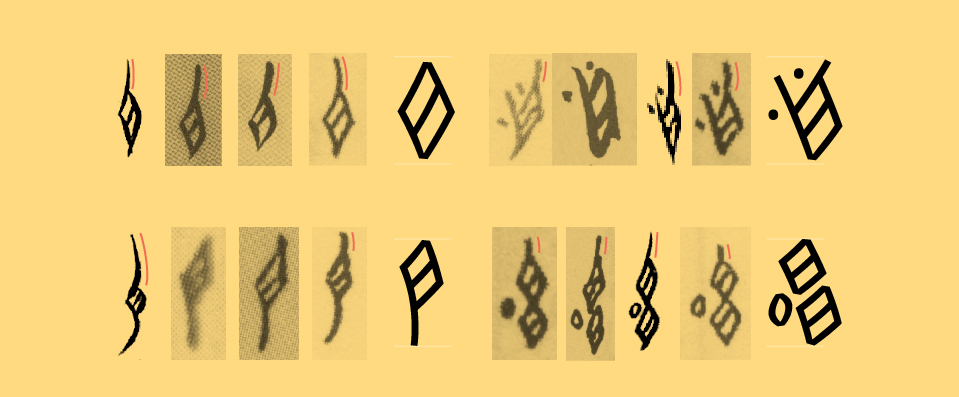
06 - Dots and circles
The dots on Nüshu characters are made with (in most cases and without particular intention of added style) a single dot made with the tip of the tool without added movement. They should convey this idea also on Noto Sans Nüshu, here with the dot borrowed from Noto Sans Latin i and j. 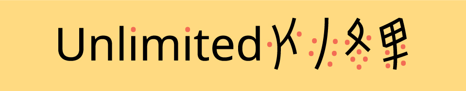
Every circled shapes in Nüshu are written with a left and right curve, never one rounded stroke. But one glyph gives a specific question with the shape of the circles: 𛋱 U1B2F1. On the Unicode chart, its appearance makes it look like a tree branch with five leaves leaning downward. But in many samples, those ‘leaves’ are more like five circles more or less close or attached to the central ‘branch’. Instead of being 5 circles with a vertical angle, they are all turning towards the central branch without being attached to it. I’ll follow this specification for this glyph in Noto Sans Nüshu. 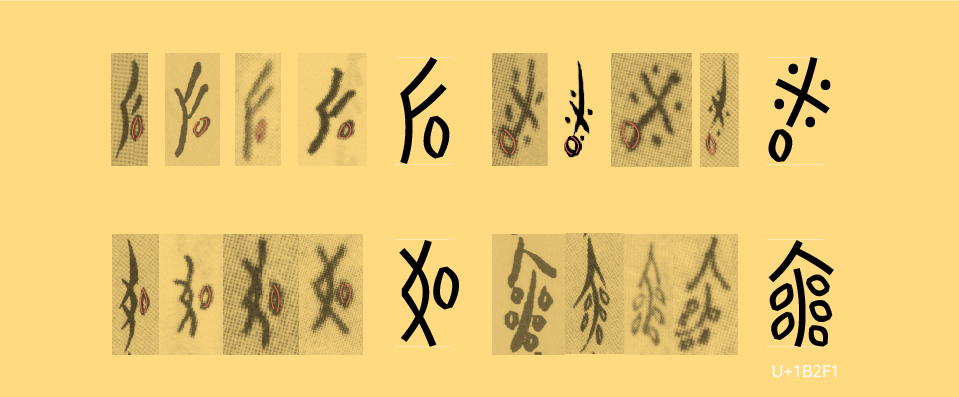
In some cases, one same writer can even make dots as circles, or even crosses… Which could be confusing, but when compared with many other samples and once they have been studied in large amount of samples, we can easily see that the dot is the “standard” construction for this detail. 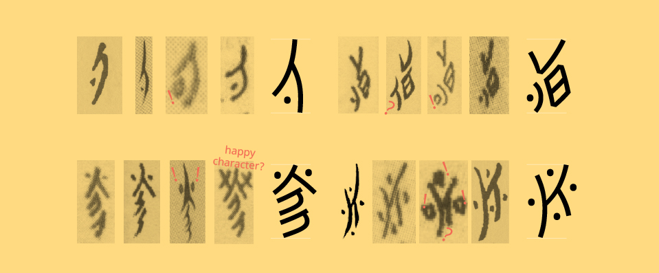
07 - Square skeletons
In most cases, and in their theoretical construction, squared parts are made with four separate diagonal strokes. In a few documents (mostly calligraphy scrolls), we see a soft single curve on the right side on these squared parts. After reaching the authors, they say that this is a stylistic feature to make characters look even more “Nüshu-ish” in their calligraphy, and that a four strokes construction is indeed the real structure of this part in every glyphs bearing this component. 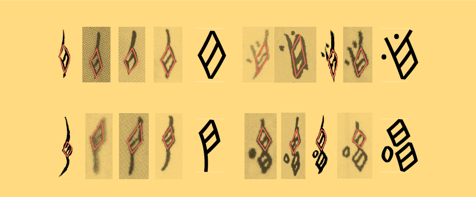
08 - Weight
08.A - Stroke thickness For the simplest glyphs, the stroke thickness can be easily matched with the one in Latin. But, just like with Chinese Hanzi, there are much more complex glyphs that need to keep the same weight color as the simple ones and stay within the same metrics. This leads to a similar challenge in optical adjustments of stroke thicknesses and counters to get to a homogeneous consistency. 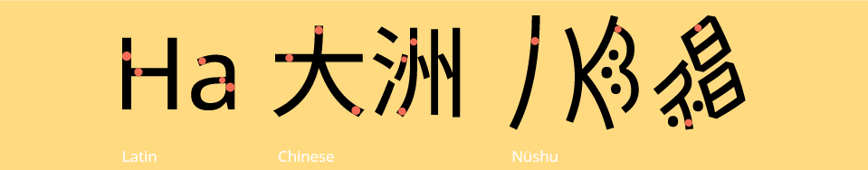
Phase 05 - Application
16 March 2020
Adjustments on vertical metrics of all glyphs have been made as I realized they were too long compared to the Latin once set up in Latin horizontally lining text…
Some glyphs might seem different from what they look like in the Unicode chart (e.g. 1B22D, 1B280, 1B2F9, 1B2CB, 1B1B7, 1B284, 1B224, 1B270, 1B2CF, 1B267, 1B1BF, 1B2F1, 1B2D2, 1B2951 1B245, 1B2A0, 1B23A, 1B2E4, 1B2AE, 1B292, 1B1F4 and 1B250, 1B201 and 1B221 and 1B266) These adjustments are designed after seeing the results of the samples sorting session, then discussed and decided with the writers and considered as ‘right’ and fully understood and readable correctly. All in all, in an effort to “standardize” the shapes of those glyphs to bring in them the characteristics of Noto Sans family, it has been a much longer work to sort out the disparities rather than actual design… unless this can be considered as design? 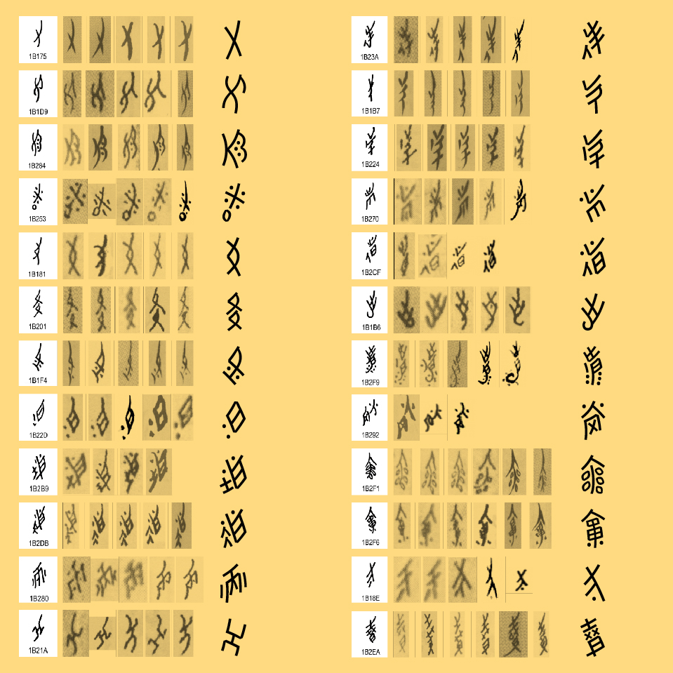
Phase 06 - Finalization
24 March 2020
A pass of corrections on widths, general proportions and stroke position have been made.
PDF file with evolutions on the font
Last add on into the character set after a suggestion thanks to @sgalal on the Github repository once it has been made public: Nüshu iteration mark U+16FE1, that can be added to the set. It is also called repetition mark and has the exact behavior as its name: once used in a text, it specifies that the previous glyph is repeated.
After a comparison with all three scripts together — Latin, Hanzi and Nüshu —, I realize very late that Nüshu glyphs were too bold and had to adjust them all by reducing the weight of about 10 units. 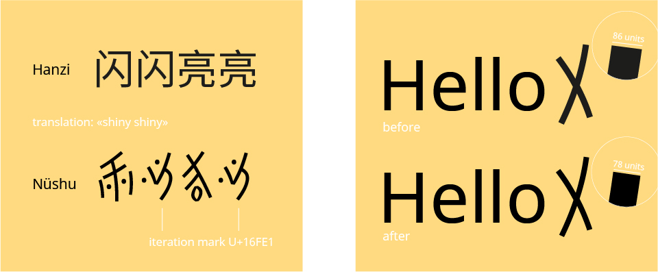
Noto Sans Nüshu characters measurements (values in units) |What | Before | Now | |————|———————–|————————-| |Top |1079 |939 | |Bottom |-325 |-203 | |Width |1020(max), 400(min) |917(max), 302(min) | |Height |1404 |1142(max), 952(min) | |Stem |86 (max), 70(min) |78(max), 54(min) | |Inktraps |to be defined |4 (like Noto Sans Latin) |
 full character set - 397 glyphs
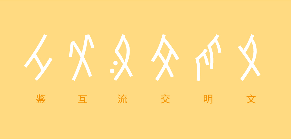 文明交流互鉴 - originally from a calligraphy by Hu Xin 胡欣
Any suggestion for improvements of this project are very much welcome!
Thank you for your interest!
Other technical informations links (for the bravest):
https://www.unicode.org/wg2/docs/n4341.pdf
http://std.dkuug.dk/jtc1/sc2/wg2/docs/n4610.pdf